.jpg)
Material and methods:
The study region is in The Pacific Ocean (32.7157° N, 117.1611° W), San Diego CA. I used the data from the station buoy 46225. I divided the Wind data into 8, 45 degrees zonal bands(focusing on vertical movements with 0 as true north). Wind direction and speed data were obtained from the NOAA datasets as well as swell direction and periods. Water temperature was obtained from UCSD, Scripps Institution of Oceanography. For the period of 2016, 2017 and 2018. Winds were captured every 10 min while Temperature wasn’t as exact. Due to different correlations for different time periods, it was difficult to conduct the correlation analysis in the entire zonal bands for the time period. Pandas, Matplotlib and Seaboarn were the libraries for EDA and visualization.
Intro and quick Definition
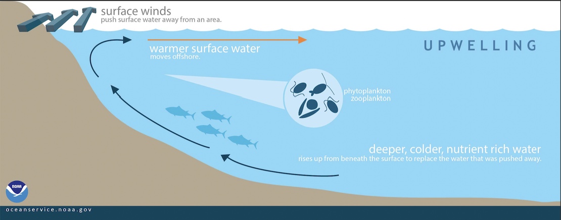
In some coastal areas of the ocean and large lakes, the combination of persistent winds and Earth’s rotation (the Coriolis effect) creates winds that tend to veer right in the northern hemisphere and left in the southern hemisphere while restrictions on lateral movements of water caused by shorelines and shallow bottoms induces upward and downward water movements, allowing upwelling of deeper, colder, full of nutrition water which is responsible for couple of amazing phenomenons, we and marine life see and feel on a daily basis! While this has a big impact on marine life, global warming, fishing industry, local economies and social behaviors, I will focus on showcasing the correlation between wind direction and intensity with water temperature variance.
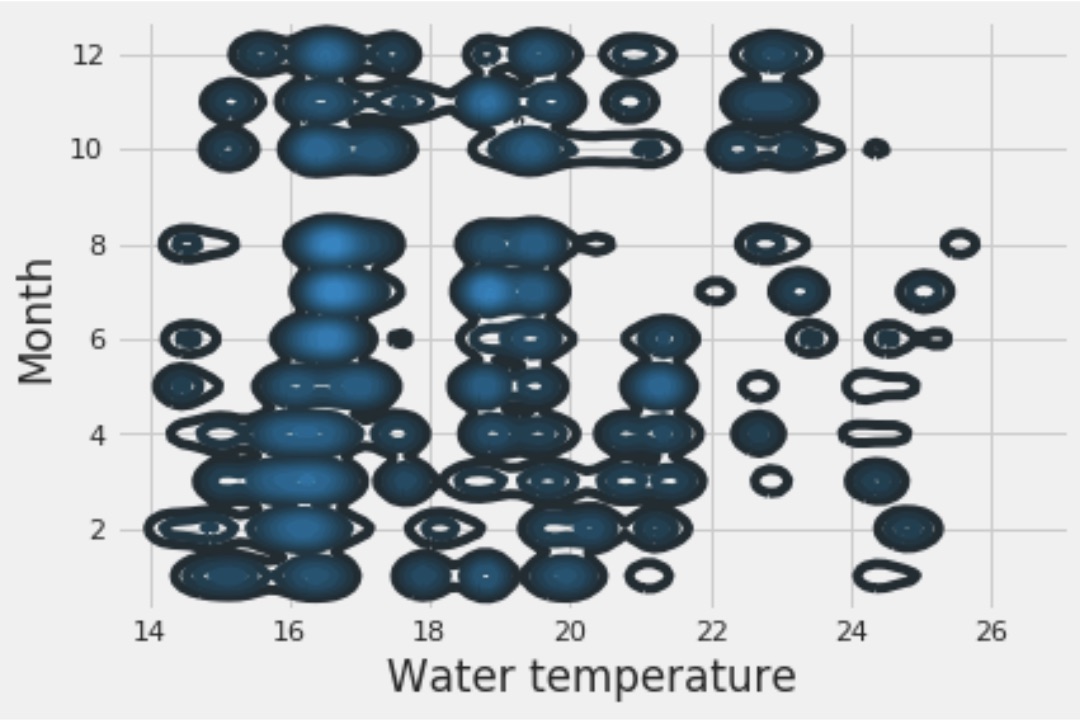
Using facets grip from Seaborn, I plotted wind direction correlating with water temperature by month, as we see the more the winds tends to gust from the north the water gets colder which is Upwelling while the south winds generate the opposit effect known as Downwelling.
Isn’t Water supposed to be warm in May?
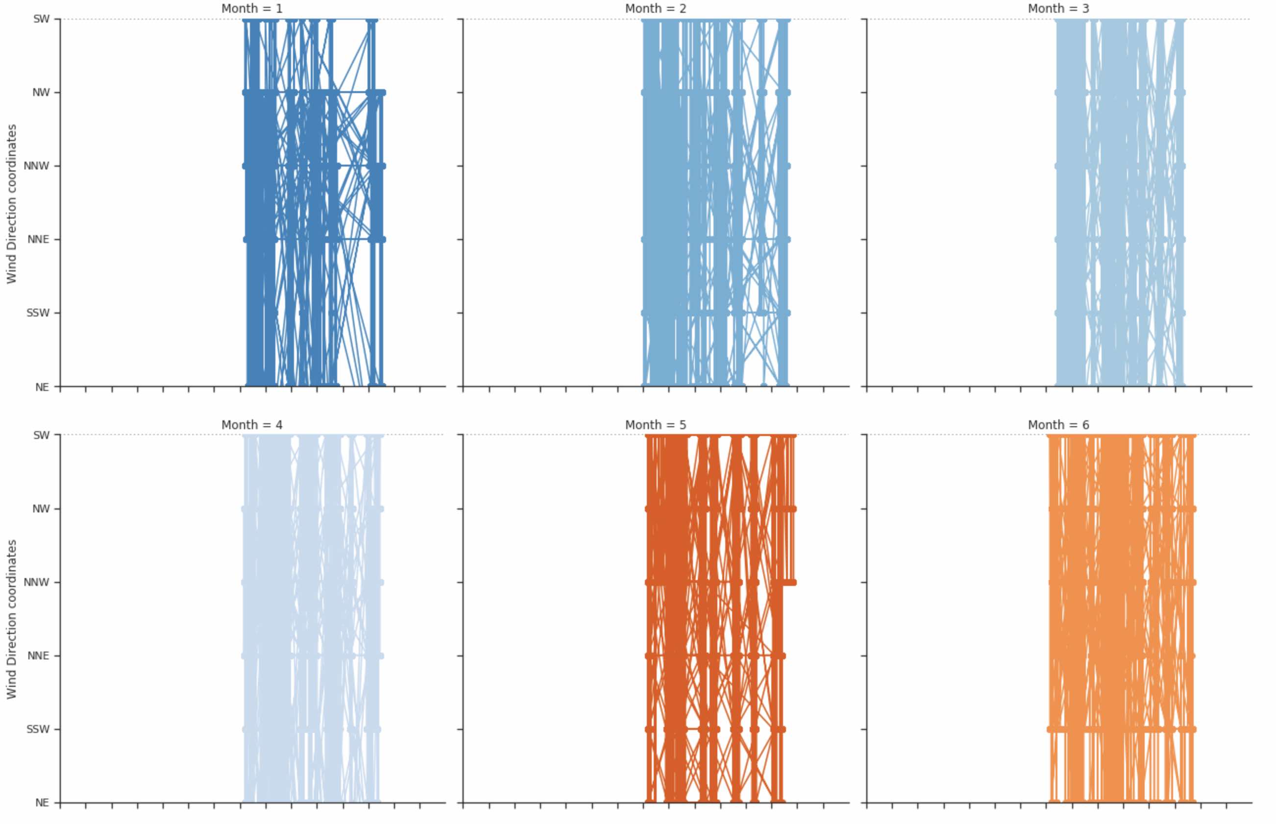
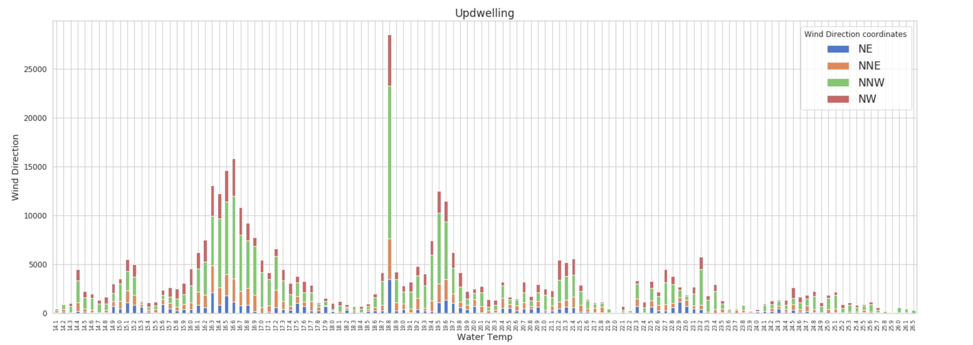
Increase of winds from NW tends to cool the water!
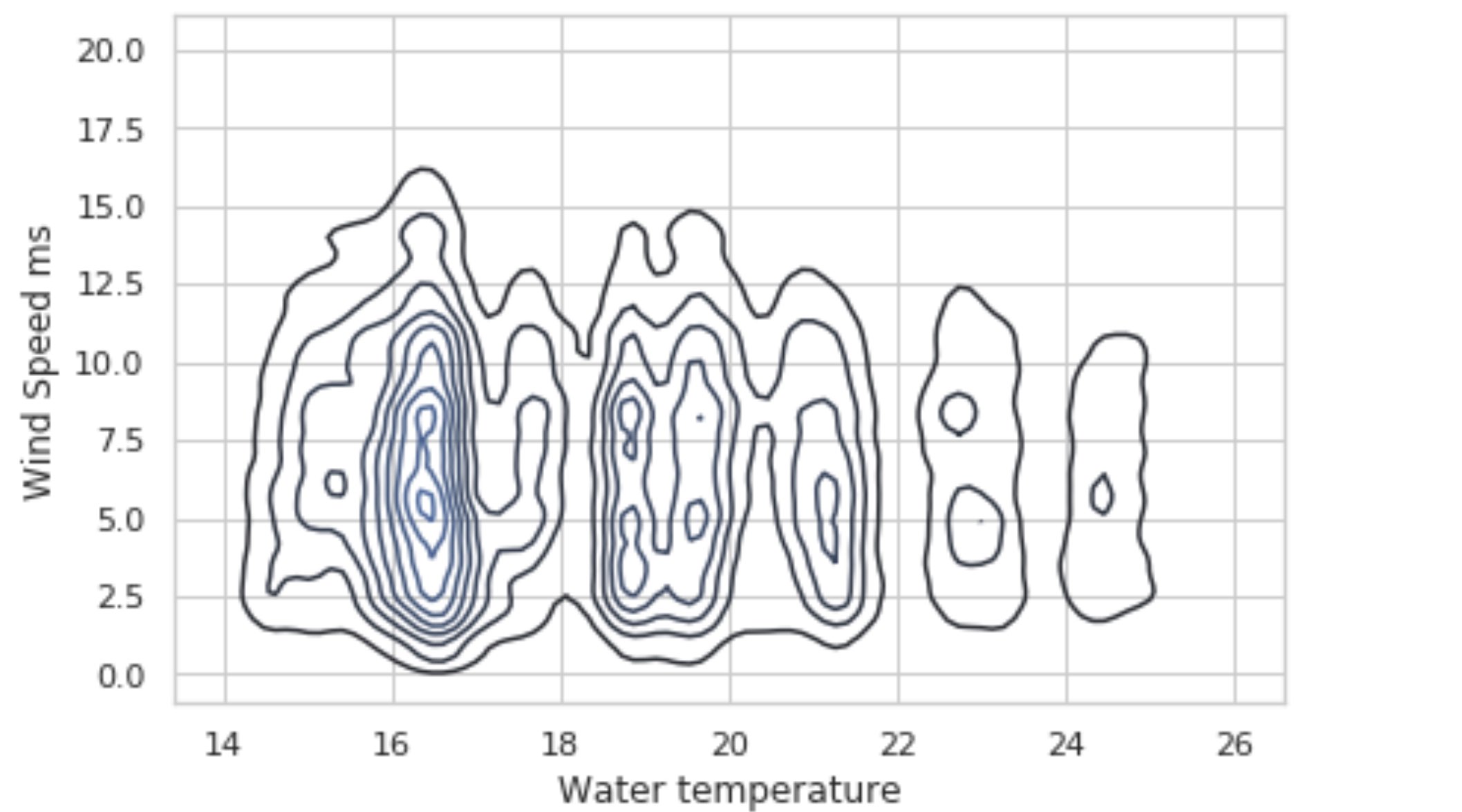
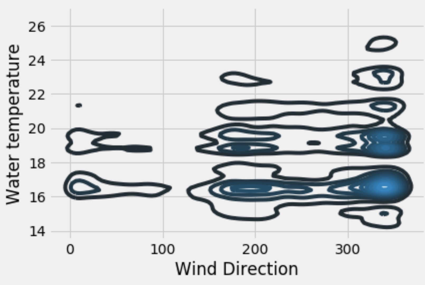 kdeplot courtesy of Seaborn
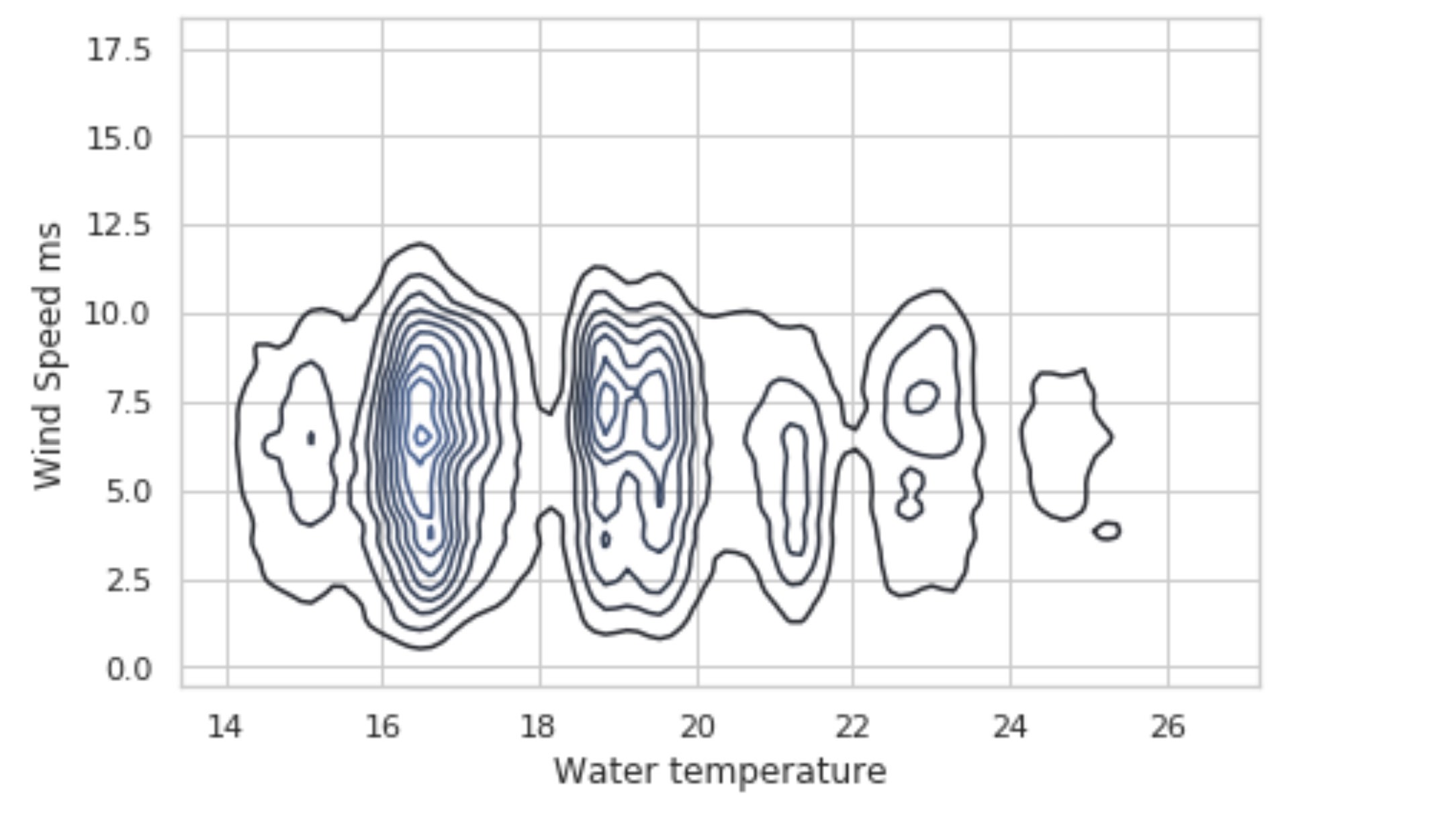
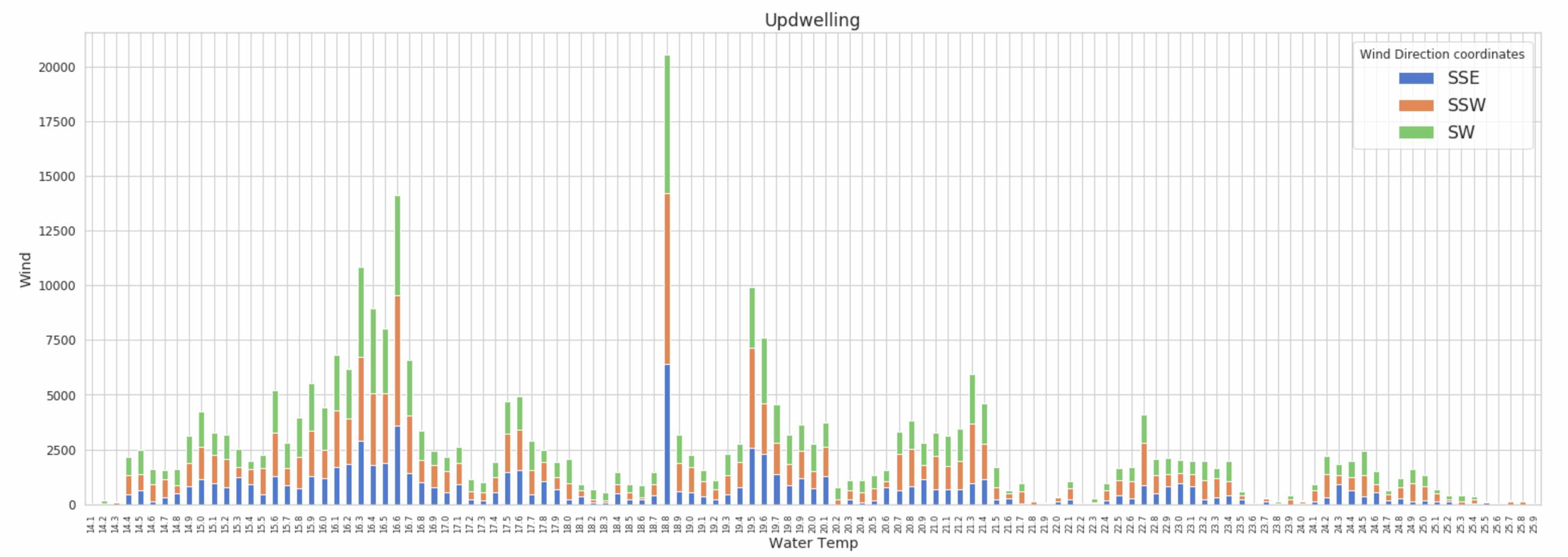
SSW and NNW winds cause the highest water temperature variances!
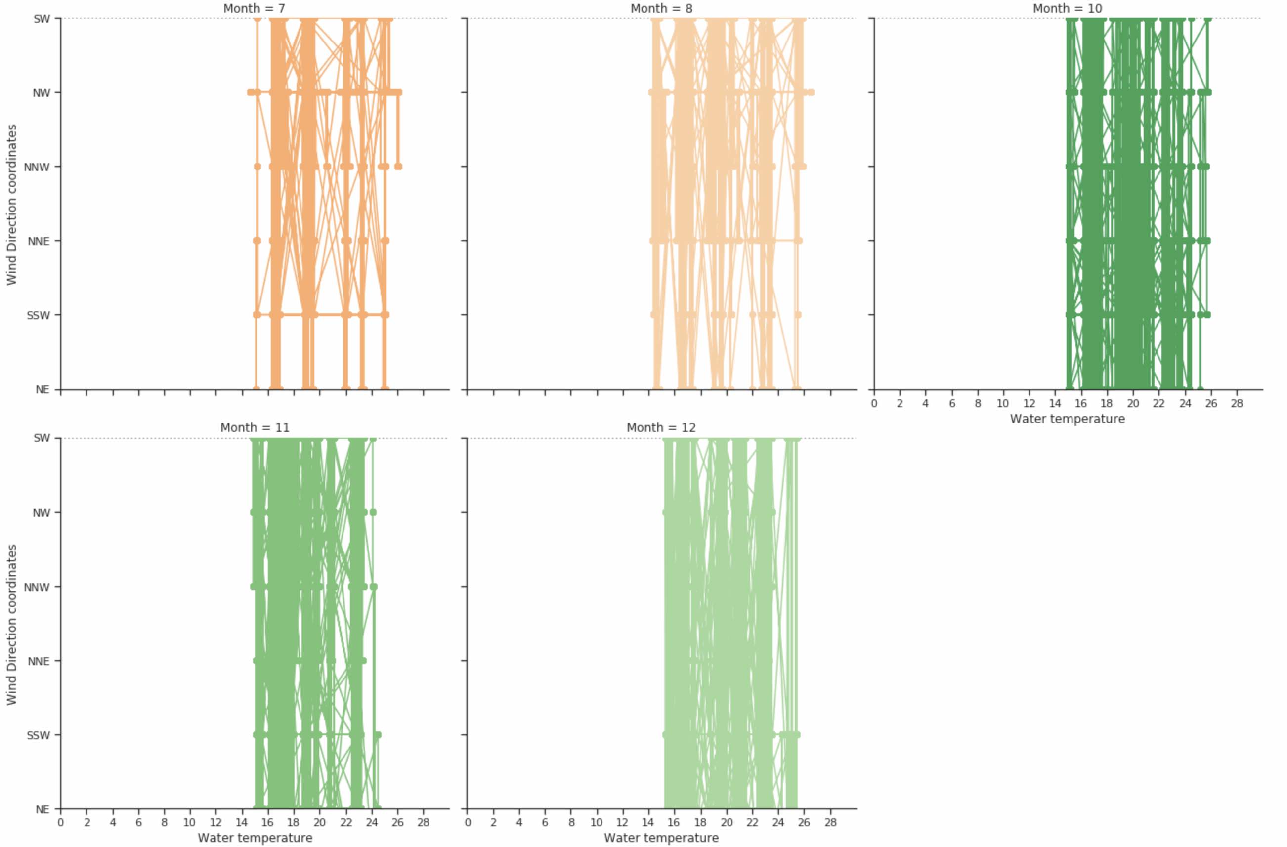
October might be the best month to visit Southern California!
Observing Water Temperature Variance Through 2018
Wind speed from NW speeds up the cooling effect!
While wind speed from SW speeds up the warming effect!
The code to the Facet Plot I used to do a monthly analysis of wind direction and water temperature: (rest of code step by step will be linked in my github) see code version here
import numpy as np
import pandas as pd
import seaborn as sns
import matplotlib.pyplot as plt
params = {'legend.fontsize': 'x-large',
          'figure.figsize': (22, 8),
         'axes.labelsize': 'large',
         'axes.titlesize':'x-large',
         'xtick.labelsize':'x-small',
         'ytick.labelsize':'medium'}
sns.set(style="ticks")
# Pulling Upwelling dataset we created fron NOAA and UCSD databases
#df = pd.DataFrame(np.c_[upwelling['Water temperature'], upwelling['Month'], upwelling['Wind Direction coordinates']],
                  columns=["Water temperature", "Month", "Wind Direction coordinates"])
# Initialize a grid of plots with an Axes for each Month
grid = sns.FacetGrid(df, col="Month", hue="Month", palette="tab20c",
                     col_wrap=4, height=5)
# Draw a horizontal line to show the starting point
grid.map(plt.axhline, y=0, ls=":", c=".5")
# Draw a line plot to show the coordinate
grid.map(plt.plot, "Water temperature", "Wind Direction coordinates", marker="o")
# Adjust the tick positions and labels
grid.set(xticks=np.arange(0,30,2), yticks=['NE', 'NNE', 'SE', 'SSE', 'SSW', 'SW', 'NW', 'NNW'],
         xlim=(0, 30), ylim=('NE', 'SW'))
# Adjust the arrangement of the plots
grid.fig.tight_layout(w_pad=1)
Sources: NOAA, Ocean Motion, UCSD